Home / Blog / The Principles of Design
The Principles of Design

By EKbana on January 05, 2023
8m read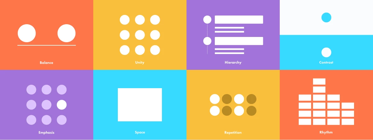
Have you ever wondered what goes into the creation of a successful design piece? Here are some visual tools that can help you structure your design compositions.
What Are Design Principles?
Design principles are guidelines, biases, and design factors that designers use as needed. Professionals from a variety of fields, including behavioral science, sociology, physics, and ergonomics, set the stage for design principles using their acquired experience and knowledge.
Principles of Design: Balance
A distribution of equal visual weight

Any element on a page has a visual weight. It can come in various shapes, sizes, colors, and textures. The elements in a design must have a certain scale for it to feel stable or balanced.
In a symmetrical design, for example, the elements on the right side have the same visual weight as the elements on the left side. Symmetrical designs are easier to balance, but they can also appear boring. Asymmetrical designs have opposite sides but have the same visual weight. Being able to create balance in asymmetrical design might result in a visually attractive design with movement.
A lack of balance will make your design feel weighty on one side and empty on the other. If you're looking for examples of design balance principles, your design is out of balance if it looks to be falling off to one side.
Principles of Design: Unity
A balanced arrangement of elements

Unity refers to the relationship or connection between the various parts within a composition and their relationship or connection to the composition as a whole, it is often achieved by utilizing a number of the aforementioned principles. Unity can give a sense of entirety or wholeness to the composition or equally break it up and create a sense of variety or disharmony.
Principles of Design: Hierarchy
Hierarchy organizes visual elements in order of importance.

Hierarchy is basically used for websites, where all the things should be in order and in a symmetric way. It is the most important element in the design. Hierarchy is used for titles and headings and formatting the layout.
Typography, Graphics, Colors, Contrast, Weight, Position, Size, and Space are all examples of design elements. This segment will look into various principles, detailing their importance and why they are essential to creating strong, well-crafted designs. The design or arrangement of elements in a way that emphasizes importance is known as the hierarchy.
Principles of Design: Contrast
A contrast that emphasizes the difference

Like objects in the physical world, every object in graphic design has its own weight. The heavier the object, the more attention it receives. It’s possible to add weight to a graphical object using size, shape, and contrast, but let’s take a closer look at how the contrast principle of design works.
Contrast is the difference between two elements on a screen. For example, black text on a white background creates visual contrast. Contrast also ties the other design principles together, since the emphasized element should contrast with all of the other elements on the page.
Principles of Design: Emphasis
A focus on the importance

Emphasis is a strategy to get the viewer’s attention to a specific design element. This can be in any form: a button, a website, or an image. The purpose is to create something that will stand out from the rest of the page. You can use different elements to highlight a specific part of your design, like lines, color, positive/negative relationships, and many more. As long as you can create contrast, either with elements or color, you’ll be creating emphasis.
Lines: help the viewer's eyes know where to go by pointing to specific elements on a page.
Shapes: can also grab attention Using a set of similar designs and breaking it up with a different shape creates conflict and helps to attract attention.
Color: can be used as an effect in any design To convey a sense of urgency and attention, buttons on a website normally contrast with the background.
Texture: may be seen in materials used to improve tactile features. A business card, for example, may include an emboss or relief on a logo to emphasize it. Texture can be applied digitally as a drop shadow on a button to make it appear three-dimensional.
Space: can also be used to emphasize specific features in your design. Enough white space surrounding an item might help to focus attention on a particular element. Apple, for example, has a simple approach to showcasing products.
Principles of Design: Space
Whitespace, also known as "negative space," applies to sections of a design that do not include any design features. The space is completely blank.

Many designers feel it is necessary to fill every pixel with some style of "design" and ignore the importance of white space. But, white space supports many important functions in a design, the most important of which is to help the design's elements breathe. Negative space can also be used to highlight specific content or elements of a design.
It can also effectively separate visual elements. This is why typography is more understandable when upper and lowercase letters are used, because negative space around lowercase characters is more diverse, helping readers to read them more easily.
Principles of Design: Repetition
Repetition is when a specific element is repeated multiple times throughout the design.

Colors, typography, text, or shapes that are repeated can help tie your design and overall appearance together.
It also helps in the retention of your brand or other important information. To help customers recognize your brand, use repetition within your entire content strategy by utilizing similar colors, typography, and brand image.
Principles of Design: Rhythm
Contrast is the difference between two or more elements such as bright and dark colors or big and small objects.

Most people associate rhythm with the music, but it is present in almost everything around us, including artwork, products, and design. Rhythm can be used to create a wide range of feelings, from comfort to passion. Rhythm is created in graphic design by the arrangement of elements and the spacing between them. For example, by repeating certain elements throughout your website or app, you can create a rhythm.